UI UX
UI Concepts - Brandon Shrader
UX Research - Brandon Shrader
User Interface, and User Experience are beautiful languages that I feel most creatives look over. I carefully plan out my designs, and understand how I handle an application, what feels right, what doesn't, and even gauge the interactions of those around me. UI UX drives the world, and successful creations.
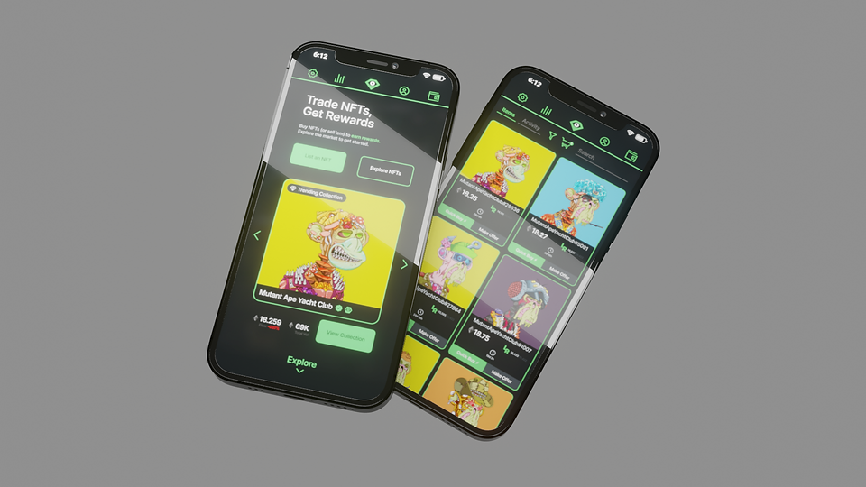
LooksRare Standalone App // Personal Concept // 2022

Current site, landing page, and collections.
Identified issues:
Not enough contrast, many dark colors
visually blend together and don't have
breaks. This leads to visual noise, and
overall confusion on where/what is related.
Top UI bar could be utilized better.
Given the space that exists, more items
could be shifted to the top to allow for a
"non-bump" experience at the bottom of
the page. A common issue is accidentally
bumping buttons with your proximal joint
on your thumbs.
An application would be a great way for
users to stay away from web-based scams
and phishing attacks. Security of assets
for consumers is and should be a priority
as this drives your companies valuation.

My iterations, of:
App launch animation,
Landing page,
Wallet selection
Collection overview
and, Checkout screen.
I've introduced a new "LR" icon to the
mockups, this is "LooksRating". Which
replaces the old "rarity" coin-stack iconism.


Twitter Spaces Rework // Personal Concept // 2022
Identified issues:
Spaces feel visually cramped with pinned
Tweets having seemingly no borders, and
are a mess of words within the space itself.
Emojis are lacking required callouts, for
example "BRB" or a "100", or even some
emoji's that I personally did not include.
Secondly, the bar extends over to an area
where as a co-host buttons are sitting.
That is a simple UI UX issue as people
often will "Mute Everyone" when trying to
send a Heart Emoji. The vertical bar being
on the right side also helps as a majority
of users are right-dominant handed.
Lastly, each user does not have a volume
adjustment for themselves. This is an a
fundamental issue as every phone,
headset, earbuds, etc are build differently.
Being able to change a single user's overall
volume would be beneficial for everyone.
Current site, landing page, and collections.


Lack of volume per-user seen here:

My iterations, of:
Improved pinned tweets,
Vertical emoji selection & new emojis,
Per-user volume when tapping on users,
Ping in ms to host at top left of space.
Many of these features should be part of
Twitter's fundamental spaces, they are
major quality of life changes, and will
help Twitter's spaces exceed even further
than they currently are.


My iteration of per-user volume: